
Wikipedia:Graphics Lab/Illustration workshop
The Graphics Lab helps improve all graphical content used by Wikimedia projects stored on the Wikimedia Commons.
The work to improve the quality and clarity of images that are proposed to them by the community. This work most often involves extracting key elements from photos, removing distracting elements, and improving the general appearance of images. Creation of drawings, diagrams and maps is also within the scope of this project if the requests are clear and the work is feasible (less than one hour).
This page is now ready to go and is awaiting your requests!. You can help by joining this project, and by requesting image improvement.
Now it's up to the English community to use this Graphics lab.
Users can request images improvement or creation of images by following the "Request Form" below, adding their request to the bottom of this page. Graphists will look at the request, and improve the image if it's useful to Wikipedia.
Request Form Format:
== Title ==
<center><gallery>
''Name of image'' (e.g. Image:Eutrophication.jpg)
</gallery></center>

'''Article(s):'''

'''Request:''' ~~~~

'''Graphist opinion:'''
Progression of Dental caries
-
 Possible tooth picture; annoying color
 -
 Possible tooth picture; but less anatomically correct
 -
 Recoloured SVG


-
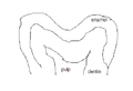 pit and fissure caries
 -

-

-

-

-

-

-
 New animation


-
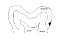 smooth surface caries
 -

-

-

-

-


Article(s): Dental caries
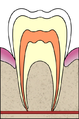
Request: This is a involved request. I would understand if some people would want to break up the work. Basically, this idea came from a series of pictures on dental caries (tooth decay) in the french wikipedia. The series of pictures showed the progression of caries. I think it would be absolutely amazing change the series of pictures into an animated gif AND have the images be more accurate with what actually happens in a tooth. I have posted two pictures of a tooth that might be preferred to be cropped to focus on a single area. I am not sure which would be better. The first one looks more anatomically correct, but the colors are really distracting. The second one is less anatomically correct, but there is less color. Because of the anatomy, I would prefer the first picture if the colors can be more neutral and if the picture could be cropped to focus on the crown of the tooth.
In addition, I have posted my absolutely terrible sketches to show what the progression should look like. For anyone who would be willing to help with this project, I will try to explain what is going on in the pictures and of course feel free to ask any questions if I am not clear:
There are two types of caries. I figured each type could have its own animation.
Pit and fissure caries (the first shown) is described as looking like two triangles sharing the same base. It begins as a point in a pit/fissure, gets larger as it goes down to the dentin. Then, at the location where enamel and dentin meet, the decay spreads laterally rapidly. Then, as it moves toward the pulp, the caries in dentin sharpens into a point.
Smooth surface caries (the second series shown) is described as looking like two triangles, with an apex of one triangle touching the base of the other. It begins as a large area in enamel and shrinks to a point as it nears the location where enamel and dentin meet. Once the decay reaches dentin, it again spreads laterally rapidly and sharpens into a point again as it moves toward the pulp.
I realize this may be a lot to do, but I would very much appreciate it! And the article would appreciate it too!!!! - Dozenist talk 22:42, 13 January 2007 (UTC)
Graphist opinion:
I've created an SVG of the image, with a more realistic colour scheme. The dentine and pulp out towards are faded out towards the bottom which IMO looks better than simply cropping it to the top. Would using the same image (without the fading out) be acceptable for the animations? Time3000 14:24, 14 January 2007 (UTC)
- The colors look a ton better! The caries will be much easier to identify in the animation that way. For that purpose, you may want to consider lightening the dentin color just slightly, but if you feel that the color is not too dark then do not bother with it. - Dozenist talk 14:36, 14 January 2007 (UTC)
- Just to let you know that I am working on the animations... Time3000 11:10, 21 January 2007 (UTC)
- Yay! That's awesome. - Dozenist talk 13:38, 21 January 2007 (UTC)
- Just to let you know that I am working on the animations... Time3000 11:10, 21 January 2007 (UTC)
Pit and fissure caries animation
OK, I've done an animation of pit and fissure caries. It's fairly basic, but it's fairly accurate (as far as I can tell). Time3000 12:25, 3 March 2007 (UTC)
- The animation is awesome! It would fit in the article perfectly. I am sure the other animation will be just as good. - Dozenist talk 17:50, 3 March 2007 (UTC)
Smooth surface caries animation
Okay, I ran across this request and thought it wouldn't be too hard. I've uploaded my animation of smooth surface caries to the gallery above. Let me know what you think. -- VegitaU 18:59, 24 June 2007 (UTC)
- The graphic looks amazing. I love how smooth the transition is! I have placed both animations in the article, and I think they look really good. At the end of the animation, since this new one moves so much faster, is there any way to make it pause for a second or two so the end result is clearly shown to the reader? Also, when the images are so close together in the article, the difference between the two may be a little distracting. I hate to ask since I have asked so much already, but is there anyway to modify the first animation (the pit-and-fissure caries one) to look like this one? I really love the animations and believe they add a lot to the article (which is almost ready to be sent to FAC). Thank you very much for all your hard work! - Dozenist talk 03:22, 25 June 2007 (UTC)
- Okay, I updated the old animation to include a 2-second delay on the last frame and made a smoother the pit caries animation. Hope this helps you out. -- VegitaU 23:30, 25 June 2007 (UTC)
- Thanks! The animations are awesome, and they look great in the article. I love it, and thanks again for the work you put in. - Dozenist talk 00:24, 26 June 2007 (UTC)
- Okay, I updated the old animation to include a 2-second delay on the last frame and made a smoother the pit caries animation. Hope this helps you out. -- VegitaU 23:30, 25 June 2007 (UTC)
Photoclinometry
Article(s): Photoclinometry
Request: If someone could make an image (probably not SVG, I don't know) that depicts the process or result of photoclinometry. It would be much appreciated. → Icez {talk | contrib} 21:49, 11 February 2007 (UTC)
Graphist Opinion:
If you wrote what that was, maybe you would get more offers Rugby471 17:23, 16 May 2007 (UTC)
- Maybe you would be better off asking at Wikipedia:Requested pictures. --Dave the Rave (DTR)talk 21:58, 9 June 2007 (UTC)
Coat of arms of Denmark
-
Danish coat of arms, 1819-1903
-
Three lions COA in SVG.
Article(s): Coat of arms of Denmark
Request: This image shows a version of the Danish arms used for almost 100 years, making it one of the most important variants. The original work of art was located in a dimly lit place, and this is the reason why a flash was used. The resulting image would benefit from a little sharpening, see the shield and the gold pattern on the royal robe. Any help would be great. Valentinian T / C 16:51, 26 May 2007 (UTC)
Graphist opinion: Is there a vector version? If so, i can be used for reference. If not, it might be worth it to create one if possible.--HereToHelp 17:33, 26 May 2007 (UTC)
- Currently, we don't have a vector version, but it would be extremely welcome. If you take a look at coat of arms of Denmark, you can see that the actual design of the insignia changed a lot over the years, I've - so far - only added images for the first 400 years, but it gets way worse after that. The version shown here was used 1819-1903, so it was a very stable version. It is almost identical to the version used 1903-1947, only one field was changed then (the red field on the SW corner was replaced with a new insignia occupying the same space). And the later 1947-72 version, also resembled much of it: see the bottom of this page (the artist hasn't been dead for 70 years, which is why I haven't uploaded it). The changes in 1903 and 1947 related to the same field representing Iceland. A user attempted to create an svg of the "three-lion" arms, see Image:COA of Denmark.svg but this image has the crown's proportions wrong, the lions look odd, and the hearts are too small and the centre ones are incorrectly placed. If anybody could draw vectors looking something like this state version and the royal arms I'd be extremely happy. Even more so as some editors are considering deleting all images from www.vector-images, so that might kill the two images in question. If anybody tries making one of these images, place ask me if you have any questions at all. I know the details by heart :) Valentinian T / C 21:47, 26 May 2007 (UTC)
- If it changed gradually over time, it sounds like an animated version might be useful? Regards, Ben Aveling 00:58, 27 May 2007 (UTC)
- An animated version might be an idea, but it would require much more material since the Danish arms dates back to the 12th century but standardization only came by 1819. The Danish arms started with containing just the three-lions symbol and ended up with a large number of different insignias arranged in different orders and styles. As provinces were lost and gained, subcoats were frequently added and removed again. Variation also happened during the reign of individual kings: one year a king's coins would show just the three lions and nine hearts, another year it could be 10 different subcoats arranged in a great shield but arranged in yet a new order, or it might be c. 10 tiny shields surrounding one bigger one. Next year again, it could be back to the symbol the government adminstration often used with just a combination of the arms of Denmark, Norway and Sweden/the Kalmar Union. Usage also shifted depending on the physical size of the coins it was shown or physical features in a building. E.g. in Rosenborg Castle, the ceiling of one chamber features around 12 small shields, nicely arranged in columns and rows as part of the ceiling's decoration. I would be very happy if something could just be done with this image here, or the two suggested vectors. One reason why the vectors would be nice is that I hope to one day bring this article to GA and FA and in that case, I would like to avoid any issues about copyrights. Other Danish Wikipedians have promised to help me with user-taken photos of relevant insignia from the later periods, but it is a big drawback that PD-art doesn't apply in Denmark. Americans have no idea how lucky you are to have PD-art, PD-USGov and similar laws. Danes have none of them. Valentinian T / C 01:24, 27 May 2007 (UTC)
- I did a new vectorization of the three lions COA. I hope this is better than the previous attempt. Chabacano 14:56, 27 May 2007 (UTC)
- It is much prettier, and both the crown of King Christian V and the colours are spot on. I just realised now that my post was a little unclear, for which I apologize. A common version used officially would be this (linked to only due to copyright reasons) or one of the official drawings shown here (most notably examples R1 and R2). The image I linked to before was from Vector-images.com so that one was of course derived from the official arms. Your vectorization resembles both the official examples R1 and R2 and the .png from vector-images.com, so I would consider it close to the official version, but still just a tad different. Given this, I believe we can still call this a new work, although it is very close to Vector-images' version. Valentinian T / C 17:44, 27 May 2007 (UTC)
- I am not sure of have understood your comment. If your concern is about copyright I would say that this new vectorization is as free as the vector-images.com . Since the png is in commons and has a free license, we can vectorize it or make derivative works. Another question is if vector-images.com are violating the laws of Denmark (and then we are too :( ) by distributing its image. Chabacano 18:00, 27 May 2007 (UTC)
- I was indeed thinking in terms of Vector-images.com, since Commons has stopped accepting uploads of vector-images material, since some admins on Commons believe that the company would prefer not seeing derived works. On the other hand, AFAIK, the company's emails have been very large, provided we don't upload the exact vector files, the company sells itself, but this is not the case here. I can't see any problems in respect of the Danish state. The Kingdom of Denmark limits itself to a shortlist of official drawings - generally made by Mr. Aage Wulff, official artist to the court, and http://www.sa.dk/sa/rigsvaaben/eksempler.htm states expressly that should any state body wish to use a drawing for official purposes that differs from the ones on this list, that state body would then have to apply the National Archives for permission in order to do a new official drawing. The purpose is clearly to avoid a proliferation of "official" drawings, and your drawing isn't an exact match to any of the official ones. Valentinian T / C 18:12, 27 May 2007 (UTC)
- It would still be great if one of you could make the photo a little clearer / sharper, but I don't know if that is possible. Valentinian T / C 12:07, 8 June 2007 (UTC)
- I was indeed thinking in terms of Vector-images.com, since Commons has stopped accepting uploads of vector-images material, since some admins on Commons believe that the company would prefer not seeing derived works. On the other hand, AFAIK, the company's emails have been very large, provided we don't upload the exact vector files, the company sells itself, but this is not the case here. I can't see any problems in respect of the Danish state. The Kingdom of Denmark limits itself to a shortlist of official drawings - generally made by Mr. Aage Wulff, official artist to the court, and http://www.sa.dk/sa/rigsvaaben/eksempler.htm states expressly that should any state body wish to use a drawing for official purposes that differs from the ones on this list, that state body would then have to apply the National Archives for permission in order to do a new official drawing. The purpose is clearly to avoid a proliferation of "official" drawings, and your drawing isn't an exact match to any of the official ones. Valentinian T / C 18:12, 27 May 2007 (UTC)
- I am not sure of have understood your comment. If your concern is about copyright I would say that this new vectorization is as free as the vector-images.com . Since the png is in commons and has a free license, we can vectorize it or make derivative works. Another question is if vector-images.com are violating the laws of Denmark (and then we are too :( ) by distributing its image. Chabacano 18:00, 27 May 2007 (UTC)
Tenrec
Can anybody help me to improve my photo of tenrec (Lesser Hedgehog Tenrec - Echinops telfairi)? If thats possible?

Article(s): no article yet
Request: Pinky sl 16:46, 30 May 2007 (UTC)
Graphist opinion: Hiya. I think the photo is fairly blurred and not very well composed for content. Yet there is room for improvement post-processing, but probably not worth it unless you demonstrate that the photograph would be a useful addition to a linked article. Thanks! --Javit 17:34, 30 May 2007 (UTC)
Coat of Arms of Bermuda
-
 Flag of Bermuda
 -
Coat of Arms of Bermuda
-
 Flag of the Governor of Bermuda


Article(s): Bermuda, among others
Request: To be honest, with all of the high-quality flags and coats of arms out there on Wikipedia, I was shocked to see this representation of the Bermudan coat of arms. Frankly, it looks as if it was done in MS Paint, or at least the lion part. The sad fact is, though, most of the images out on the internet are also of pretty poor quality. There are a few that I found that may come in handy, though:
- This PDF file comes straight from the Bermudan government website. The coat of arms has rather thick outlining and it's in black and white, but, in theory, it should be the most faithful representation as it comes from the government. It's really the best thing I could find, as there isn't a specific section of the website devoted to the Bermudan flag or coat of arms (the tourism site has a low-quality photo to illustrate its description of the flag).
- Probably the next best thing can be found here, from vexilla-mundi.com. The lion's head is a tad different and whatever part of the lion between the hands and feet that stick out from behind the shield look like something out of a Dr. Seuss book. But compared to others out there, it's not bad.
As far as I searched, the rest were pretty much the same as (if not worse than) the existing image or were too low-quality for them to be usable (I'm referring mainly to photos). I really hope we can improve this because if someone were to recreate my country's flag like this, I'd be pretty peeved. -Nameneko 22:09, 31 May 2007 (UTC)
Graphist opinion:
Image:Georgia. Flag of National Guard.gif
-
 PNG Version
 -
 PNG Version
 -
 SVG Version, anyone feel free to finish
 -
 SVG Version, anyone feel free to finish


Article(s): Military of Georgia (country)
Request: There seems to be a bug in these files. The stars / crosses are ok at full size, but they appear misshaped when the images are shrunk to gallery size. Any help would be great. Valentinian T / C 01:47, 16 June 2007 (UTC)
Graphist opinion: I see what you mean, I might as well convert them to svg, they'll be a lot more useful in Wikipedia and it should get rid of any bugs. > Rugby471 talk 06:52, 16 June 2007 (UTC)
- That sounds wonderful. Thanks a lot. Btw, if you create vectors of the crowned shield and the crosses, you'll have the main components of image:Georgia. Main Military flag.gif as well. Valentinian T / C 22:26, 16 June 2007 (UTC)
Okay, turning them into SVG's proved a little more difficult than I anticipated, the only thing that is holding me back, is the crown and the emblem in the middle of the crest. Currently I don't have enough time on my hands to draw them, so what I have done is converted the images to PNG ( that should sort out any bugs ) and uploaded two work in progresses of the SVG's, if any other Graphists sees this, feel free to pick up where I left off on the SVG side of things. Again sorry I couldn't do the SVG's. > Rugby471 talk 09:36, 17 June 2007 (UTC)
- The pngs were also very helpful. Thanks for the help. Valentinian T / C 00:14, 19 June 2007 (UTC)
I've had a go at the emblem in the middle, and updated one of the SVGs. I've put a slight outline on all the shapes, for consistency with the GIFs, but also because the finer details look better with an outline, and I thought it would be better to be consistent.
- It's just the crown that needs vectorising there now. I don't know if it can be copied from another image somewhere, but it would be a bit of a pain to vectorise using the GIF's resolution. CountingPine 17:50, 20 June 2007 (UTC)
- The same crown appears on Image:Georgia_coa.png which has a higher resolution. Valentinian T / C 17:56, 20 June 2007 (UTC)
- @CountingPine good job vectorising those emblems, I've added the emblem to the other SVG > Rugby471 talk 16:34, 21 June 2007 (UTC)
- Btw, the white parts of image:Georgia. Standard of Minister of Defence.svg are actually transparent. They should be converted to plain white. The other image doesn't have this problem. Valentinian T / C 17:12, 21 June 2007 (UTC)
- @CountingPine good job vectorising those emblems, I've added the emblem to the other SVG > Rugby471 talk 16:34, 21 June 2007 (UTC)
- Done > Rugby471 talk 18:30, 21 June 2007 (UTC)
- Just to be a complete pain in the neck :) The shield has one tiny error: the two ends of the band cross each other NE of the sword, but the original image shows the left-hand end of the band on top of the right-hand end. The opposite is the case here. Valentinian T / C 09:45, 22 June 2007 (UTC)
- Not at all, thanks for pointing it out. I'd designed the ribbon with that in mind, but somewhere along the line I must have just messed up the order. a bit. I'll upload a new version. Thanks. CountingPine 16:09, 22 June 2007 (UTC)
- Just to be a complete pain in the neck :) The shield has one tiny error: the two ends of the band cross each other NE of the sword, but the original image shows the left-hand end of the band on top of the right-hand end. The opposite is the case here. Valentinian T / C 09:45, 22 June 2007 (UTC)
- Done > Rugby471 talk 18:30, 21 June 2007 (UTC)
The original Mercury seven
-
The original Mercury seven
Article(s): Would fit into articles about Project Mercury
Request: I really like this photo, but it's very noisy and the shadows are hard. Maybe it can be improved? --startaq 20:01, 18 June 2007 (UTC)
Graphist opinion: (Disclaimer:I'm not a graphist but I think the photo caught my eye.) I went through Project Mercury and found that it didn't really have a place for it. This is a problem with the article rather than the image; having read and seen The Right Stuff I know the astronauts had to endure all sorts of preparation (like this photo) and yet the article doesn't mention it. I still think that it is worthy of the attention of a qualified graphist.--HereToHelp 23:12, 18 June 2007 (UTC)
- I don't know if there's very much detail available in the shadows... brightening the darkest parts of the image do make more detail available near the eyes of the person to the furthest left, and a small bit of extra detail in the eyes of the person to the furthest right. Other than that, I think brightening won't do much other than increase the noise. --Interiot 23:27, 21 June 2007 (UTC)
Scouting in Burma
These next four requests are related, the Wikipedia:WikiProject Scouting has articles on Scouting in every country, and I am writing those on the nations that Scouting has been suppressed in or where it has lain dormant in for years. Most modern Scout organizations have made readily available good-quality legible variants of their national emblems for educational purposes such as Wikipedia. For defunct or dormant organizations, generally the only images available are poor photocopies passed from hand to hand, or scans of decades-old patches where the insignia is not clear or bright. We have good images for Mainland China, Vietnam and Cuba, but lack in some other areas. With the exception of Ethiopia, all of these are not-presently-in-use, and based on the governments the copyrights may or may not be valid, but with the improvements I am asking for, these would be Wikipedia renditions separate from any copyrighted variant. Our goal is to have these emblems available on Commons once there are usable variants of them. Someday these nations will have their Scouts back, and we want to provide them with good histories they can use as they rebuild.
-
small but shows basic details
-
shows the griffin-like supporters that need to be in red along both sides of the central petal
-

-
 text for the scroll
 -
 text for the scroll
_red.svg?lang=en)
Article(s): Scouting in Burma
Request: I would ask that the image be enlarged to show detail, the green brightened up so as not to show as black on some monitors, the details on the griffins crisped-up to show detail, and the text on the scroll also made clearer. Chris 05:56, 27 June 2007 (UTC)
- ps-if it would help, you can completely leave off the green ovoid background, so as to highlight the emblem itself. Thanks! Chris 16:35, 27 June 2007 (UTC)
Graphist opinion:Do you need an exact copy of the griffin but optimized, or do you want it recolored also?Akiramenai 08:55, 27 June 2007 (UTC)
- It doesn't have to be an exact copy, that was just the best one I could find to show detail. It does need to be in red, though. There is another image at Chinthe if it would help. And thank you so much for this! Chris 16:32, 27 June 2007 (UTC)
I made the svg of the text but I don't know how to get it to bend, if someone can do that and put it in the pic, all that would be left is the finalisation.--Cronholm144 15:37, 28 June 2007 (UTC)
- Also, as in the request above, could you enlarge the image to show detail? Image:Laos.jpg below, at 167 × 219 pixels, 100px, is a really good size for details. And for the chinthe to show up well, a brighter red, rather than the maroon, might look crisper. Perhaps red body with maroon outlining? :) Thanks again, folks, you are wonderful! Chris 07:47, 29 June 2007 (UTC)
I'll get on it.--Cronholm144 11:36, 29 June 2007 (UTC)
Scouting in Laos
-
 large scan of the badge, shows color scheme, but it is dark and shows badly on some monitors
 -
older small line art of the badge, but it shows the scroll and knot and text that the newer one does not

Article(s): Scouting in Laos
Request: I would ask that the images be merged, so to speak, find a median size between them; using the line art, make the details in the deep blue of the badge, except where they are red or white on the badge, and incorporate both the color scheme and the scroll and knot into the new image. Chris 05:56, 27 June 2007 (UTC)
- addendum Image:Laos.jpg, at 167 × 219 pixels, 100px, is a really good size for details. Chris 08:09, 29 June 2007 (UTC)
Graphist opinion:
Ethiopia Scout Association
-
small and grainy but shows present color scheme and proportions
-
larger line art showing text on scroll, 1970s shape and proportions
-
larger line art showing text on scroll, 1970s shape and proportions svg version 1
-
 Second update
 -
I uploaded this for illustration, I think Rugby471 is correct in that the green trefoil should be large as he has it

Article(s): Ethiopia Scout Association
Request: I would ask that the images again be merged, to show the text on the scroll from the line art, but with the color scheme of the smaller variant, and again to find a median size, and clean up the coloration to uniform. Chris 05:56, 27 June 2007 (UTC)
Graphist opinion: Okay, i'll get to work on creating a vector. > Rugby471 talk ⚔ 15:41, 27 June 2007 (UTC) First update on it is above, I will continuing working on it (obviously), but if there is anything you object to, please say now. > Rugby471 talk ⚔ 16:17, 27 June 2007 (UTC)
- What a great start, thank you so much! I really like what you've done; I think the narrower left hand scaling is the more modern variant, however. At this point though I think either scaling will be great! Thanks again! Chris 16:41, 27 June 2007 (UTC)
I created the alternate 1970's svg, but that lion thing is too small to make out.--Cronholm144 03:19, 28 June 2007 (UTC)
- The lion is the Lion of Judah. It can be seen in the old Ethiopian Empire flag here (Image:Flag of Ethiopia (1897).png is a smaller version). Mike Dillon 03:30, 28 June 2007 (UTC)
Thanks I will get on it. There is the lion, its rough because I had to base it off of a very pixelated image but I think if someone synthesizes the two it will be done. I can't download svgs for some reason so it will have to be someone else--Cronholm144 04:36, 28 June 2007 (UTC)
Uploaded a second update, changed the colors to match Cronholm's one and added the 'banner thing' at the bottom. Only thing now is the lion, unfortunately I can't do it as I don't have enough time. @Cronholm, if that is the finished lion then tell me and i'll put it in my SVG, if it isn't could you upload ( with your svg ) the finished one, cheers. > Rugby471 talk ⚔ 16:43, 28 June 2007 (UTC)
Hey Rugby, I will work on the lion tonight, I think that we should go with the colour scheme in the newest badge, the colours that I picked were awful and last minute. Also, looking at the new badge it appears that they are using the non-uniform star, should we switch? Anyway, I would go ahead and finish everything up by combining yours and mine for a final version but I can't download svg (or I just don't know how). So I think that we should combine my scroll and your trefoil. And maybe switch the stars, then its just a matter of adding the lion.--Cronholm144 17:36, 28 June 2007 (UTC)
- Cool, as regards to downloading SVG, there are two ways,
1) (I see you are using Firefox) go to the SVG's page, and below the image where it says ****.svg (file size: 133 KB, MIME type: image/svg+xml) and right click on that, and select Save link as and you have your SVG!
2) Go to the SVG's page, and below the image where it says ****.svg (file size: 133 KB, MIME type: image/svg+xml) and left click on that, and on the new page displaying the SVG (we are not on wikipedia any more) right click and select View Page Source, there you have the SVG code, now paste all of this into a text document and remember to save it as a .svg, and you have your SVG !
Unfortunately my computer doesn't give svg as an option, and that is at the heart of my troubles. I think it is the fact that I use Vista...sigh.--Cronholm144 21:42, 28 June 2007 (UTC)
- No, Windows in general has no built-in SVG support. If you use Opera, then you'll have built-in SVG support in your browser. I'm not sure about Firefox. Alternatively, you can download the file by right-clicking the link underneath the image preview on the image page and clicking Save As…. Then you can open the image in an SVG editor such as Inkscape. Stannered 22:26, 28 June 2007 (UTC)
I can only "save as" in png format for svgs.--Cronholm144 22:50, 28 June 2007 (UTC)
- I just tried in Firefox and it seemed to work. You need to click the image to go to its image description page, then underneath the preview of the image you will see
This is a lossless scalable vector image. Base size: x × y pixels.
- Right-click the link to (filename).svg and hit "Save Link As...". Re-reading the thread it seems this is almost identical to the instructions given by User:Rugby471. I can only assume that you're not correctly getting to the image description page? I am 99.8% sure that this is not a Vista problem. Stannered 00:09, 29 June 2007 (UTC)
- I love how you guys cooperate, this is Wikipedia at its best! I am so glad I came here! One last suggestion if I may, then this one is good to go. Cronholm's version incorporates everything nicely, could we more center the stars in the red areas, like Rugby's version? You rock! Chris 07:53, 29 June 2007 (UTC)
Got it! Thanks for your patience. I was misreading your concise instructions, completely my fault.--Cronholm144 11:04, 29 June 2007 (UTC)
Iran Scout Organization
-
this one I would like to ask for a line-drawing or clearer variant; the badge is quite worn
-
First Edit
-
 it's kind of a representation of this idea, I believe
 -
this one I would like to ask to be made larger to show detail
-
rough start

Article(s): Iran Scout Organization
Request:
- For the red emblem I would like to ask for a line-drawing or clearer variant; the badge is quite worn.
- The red-white-green emblem I would like to ask to be made larger to show detail. Chris 05:56, 27 June 2007 (UTC)
Graphist opinion:
Red Emblem
Okay, i'll get to work on a vector. > Rugby471 talk ⚔ 16:57, 28 June 2007 (UTC)
- Okay, I know it isn't much, but I've started the line drawing, i have done the outline and a few of the features inside, is this okay so far ? > Rugby471 talk ⚔ 17:12, 28 June 2007 (UTC)
- Actually that's a great start and way better than I could do! I have added the Image:Faravahar.png because I believe it is the concept they're driving at. Besides, I didn't have a Journey album handy. ;) Also, check out The Lion and Sun for ideas on those themes. (weird, that flag shares a lot in common with Ethiopia) And thanks again! Chris 08:15, 29 June 2007 (UTC)
Red-White-Green Emblem
I need the script I can't make it out.--Cronholm144 03:37, 28 June 2007 (UTC)
- User:Akiramenai of the Wikipedia:Graphic Lab here has on their user page that they are a speaker of Farsi, perhaps that will help? Maybe making the image perhaps double or triple size will allow the text to be put in easily. Image:Laos.jpg above, at 167 × 219 pixels, 100px, is a really good size to show details. Chris 04:43, 28 June 2007 (UTC)